How We Made the Bless Launch Film
We used the landing page for its cinematic style, the dashboard for product screens, and two reviews to bring the story back to Bless's core message.
From brief to final cut.
Separate inspiration from product footage
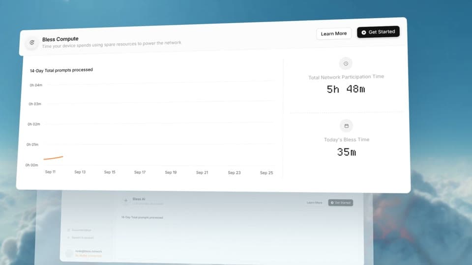
The brief linked both the Bless landing page and its dashboard. We recorded the landing page for its visual language, then logged in and captured dashboard sections for the actual product UI. We also pointed to Bless's own X material as a reference for style and emphasis, explicitly asking that its images and videos stay out of the film.
Choose one message from many features
The capture included Rewards, Connect AI, and Staking, but we did not want a catalogue of every feature. We asked Ghostmotion to build a cinematic launch film around a small number of ideas. We uploaded “VYZEE” from its beginning to set the cut's pace.
Correct the first draft's emphasis
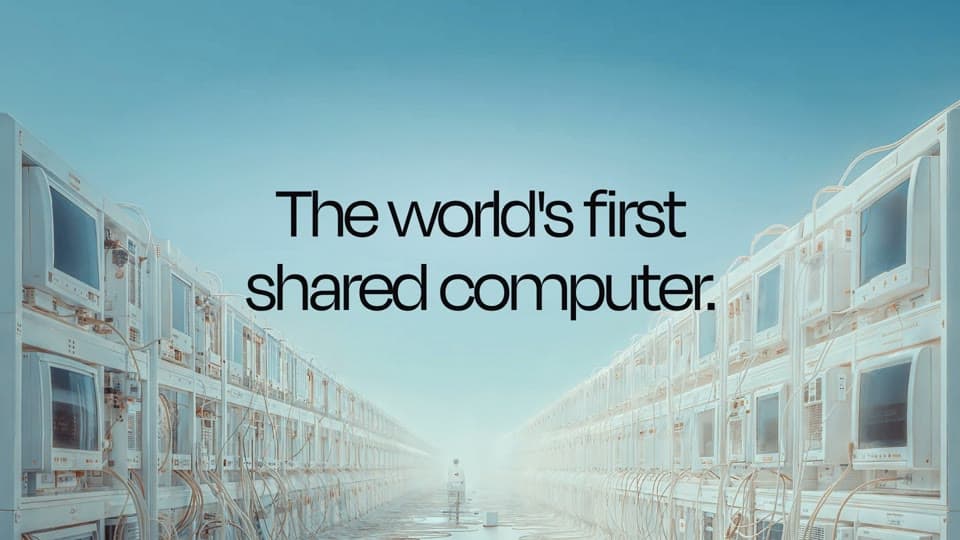
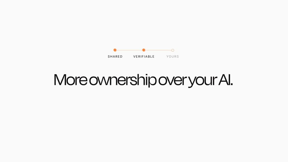
The first version spent time on features that were not the point of the film. We redirected the story toward Bless's own positioning around a shared computer, shared AI, and more ownership over AI. We also asked for a smoother transition between those ideas, less mid-film flicker, and no extra logo in the opening.
Make the final screen clearer
A second review removed a surplus opening line and asked for a better presentation of the dashboard. That kept the conceptual story and the real interface connected without showing the marketing page as though it were the product.
Three frames. One story.
Make the next cut better.
- Label each source by role: a landing page can guide the look while a dashboard supplies product screens.
- Use a reference video for direction without lifting its footage or images.
- When the edit drifts into a feature list, return to the message the brand itself leads with.